Craft Bikes
Craft Bikes
Craft Bikes
Overview
This was a school group project, where we worked in a team of five UI/UX-designers. My team were tasked with creating a webshop where "Customers can order bikes and custom design them as well as choose accessories", and the main task of the project was to focus on the customization tool.
We started by reducing the scope of the project to just focusing on customizing montain bikes instead of any type of bike. During the project we conducted market research, user research, design iteration and ofcourse user testing.
Category
Category
Category
UI & UX Design
Role
Role
Role
UI/UX Designer, UX Researcher
Year
Year
Year
2024
Process
Market Research
We conducted a competitive analysis to gain a clear understanding of existing websites and assess our competitors' strategies. Our focus was on mountain biking websites that offer bike customization. We examined each site's voice, brand, and tone, as well as their navigation, target audience, user journey, website hierarchy, and standout features or functionalities.
Findings:
User Journey: Generally straightforward but sometimes confusing due to lack of visibility indicators and distracting elements.
Pain Points: Poor navigation indicators, low contrast, busy interfaces, and performance issues.
Hierarchy: Cluttered designs made essential information hard to find.
Standout Features: High-quality images, custom bike builder tools
User Research
For our user research we conducted five interviews lasting 15-20 minutes each, either in-person or online based on participants' preferences. These interviews focused on understanding our target audience and identifying behavioral patterns among individuals interested in purchasing mountain bikes online. We specifically targeted respondents who had previously bought a mountain bike.
Insights
Our research emphasized the importance of precise language and customized bicycle specifications to meet cyclists' needs, considering factors like measurement, height, and other details.
From our interviews, we identified common traits among our users: thorough research before purchasing and a focus on quality and functionality. We consolidated these insights into a single archetype: "The detail-oriented," driven by the pursuit of the best quality and an expectation of good service.
Brand Development
We struggled to find colors that fit our sporty, premium, and simple design goals. Initially, we chose orange and dark blue, but the orange hue resembled an error message, and the dark blue lacked vibrancy. Feedback confirmed the need for a change.
We introduced a light green with yellow undertones as a balanced solution, but making it WCAG-compliant was tricky. Adding a thin black stroke resolved the issue while keeping the desired aesthetic.
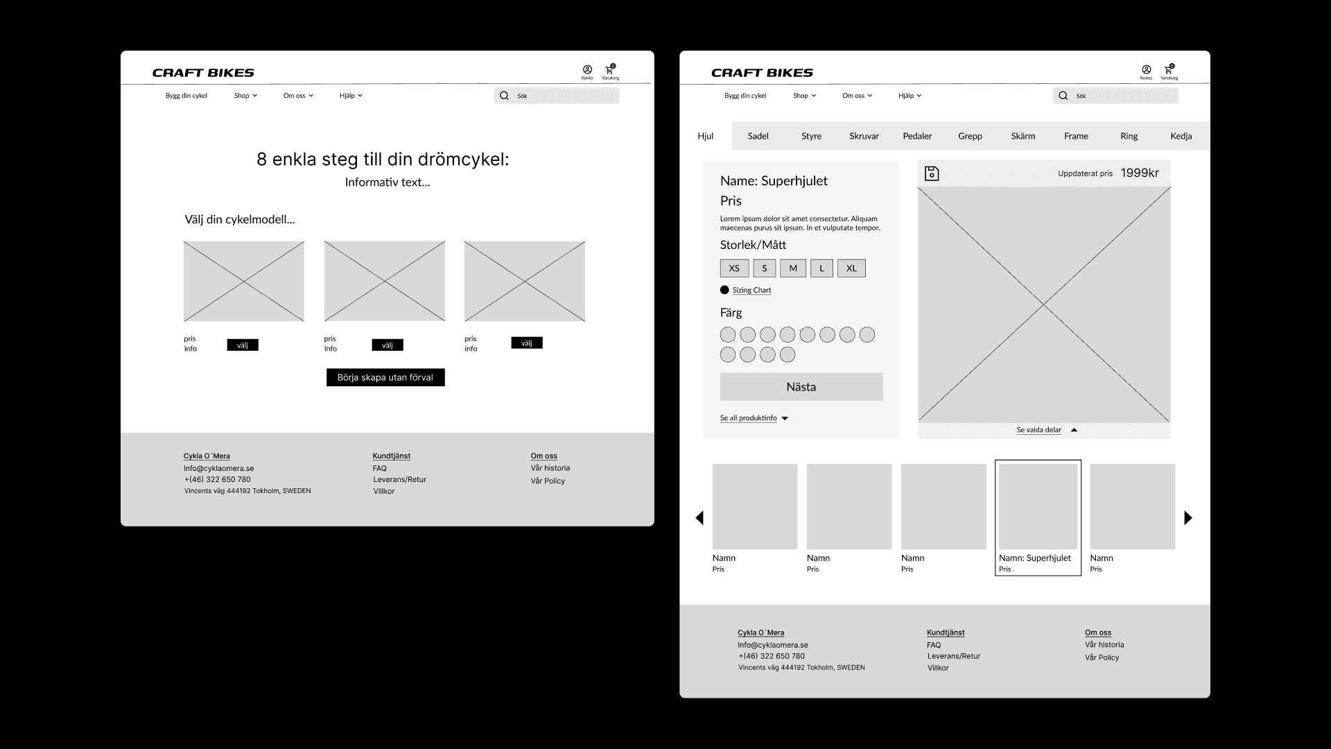
Guided by simplicity, we focused on clean layouts, intuitive navigation, and minimalist elements to ensure the design remained sleek and user-friendly.






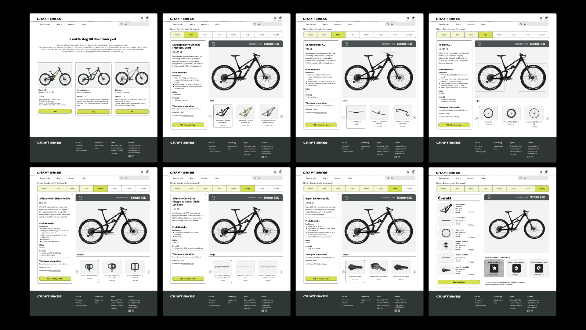


User Testing
We conducted usability testing on the "Build Your Bike" flow to gather feedback and improve the user experience. Our main goals were to assess whether the tool effectively conveyed sportiness, premium quality, and simplicity, tailored to our detail-oriented target audience.
We used controlled observation tests to see how these users interacted with the bike-building tool and to identify areas for improvement.
Test Participants
The tests involved six individuals from our target audience, selected for their detail-oriented nature. These participants had previously been interviewed during our user research phase, ensuring alignment with our demographic.
Findings:
Sportiness: Users felt the tool lacked a sporty personality, despite the green color. They suggested incorporating sportier fonts, interface elements, and images/videos.
Premium Quality: Some users found the site premium due to its serious tone and credible design. However, others noted inconsistencies in information and component design that detracted from its premium feel.
Simplicity: All participants appreciated the site’s clarity and simplicity. They found it easy to navigate, build their bike, and backtrack if needed. However, they suggested clearer steps and better component overview.
Positive Feedback:
Clear frames around selected categories.
User-friendly and straightforward interface.
Easy navigation through the build process.
Detailed product overview.
Uniform design with a good layout.
Fast and efficient experience.
Suggested Improvements:
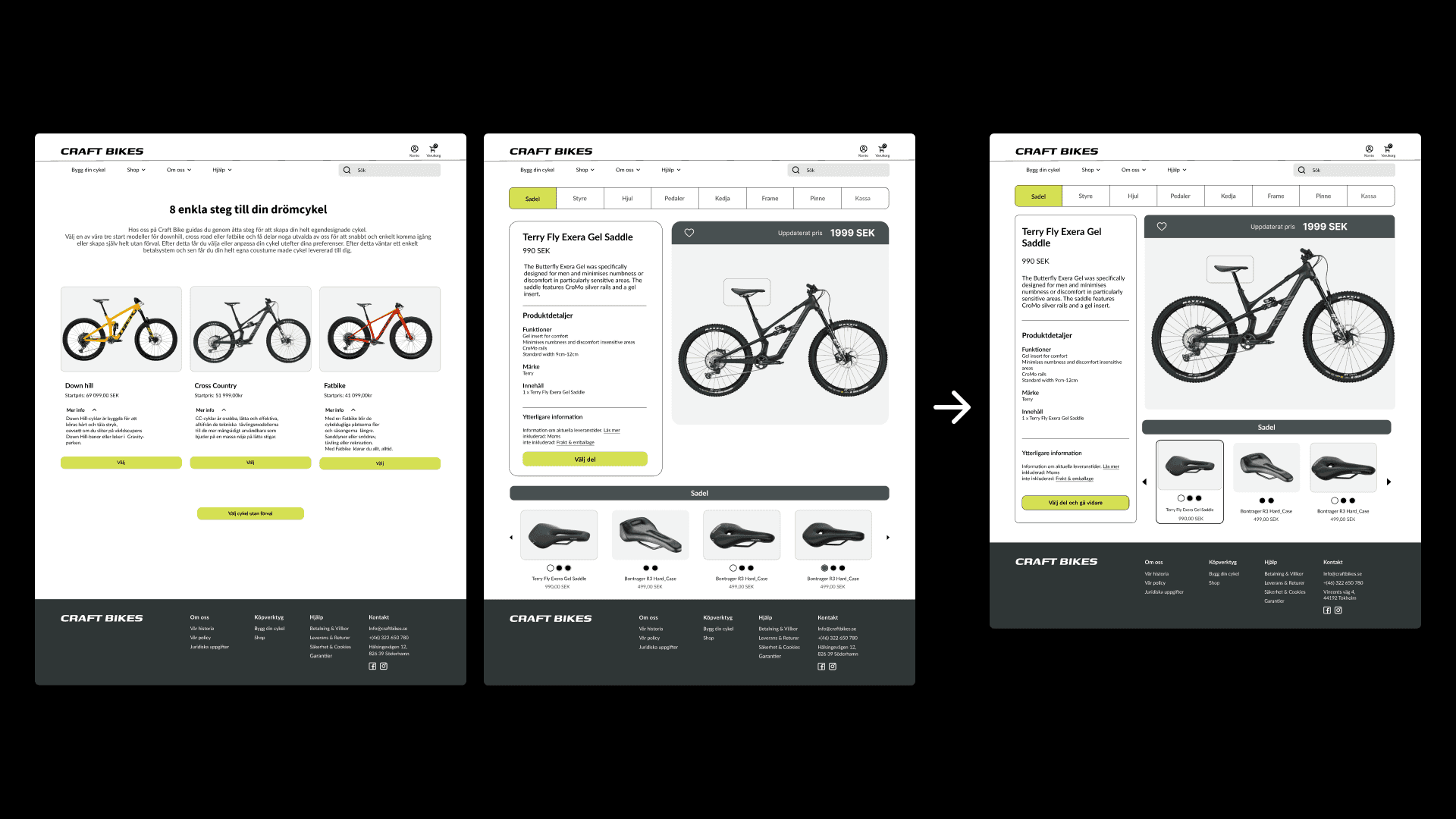
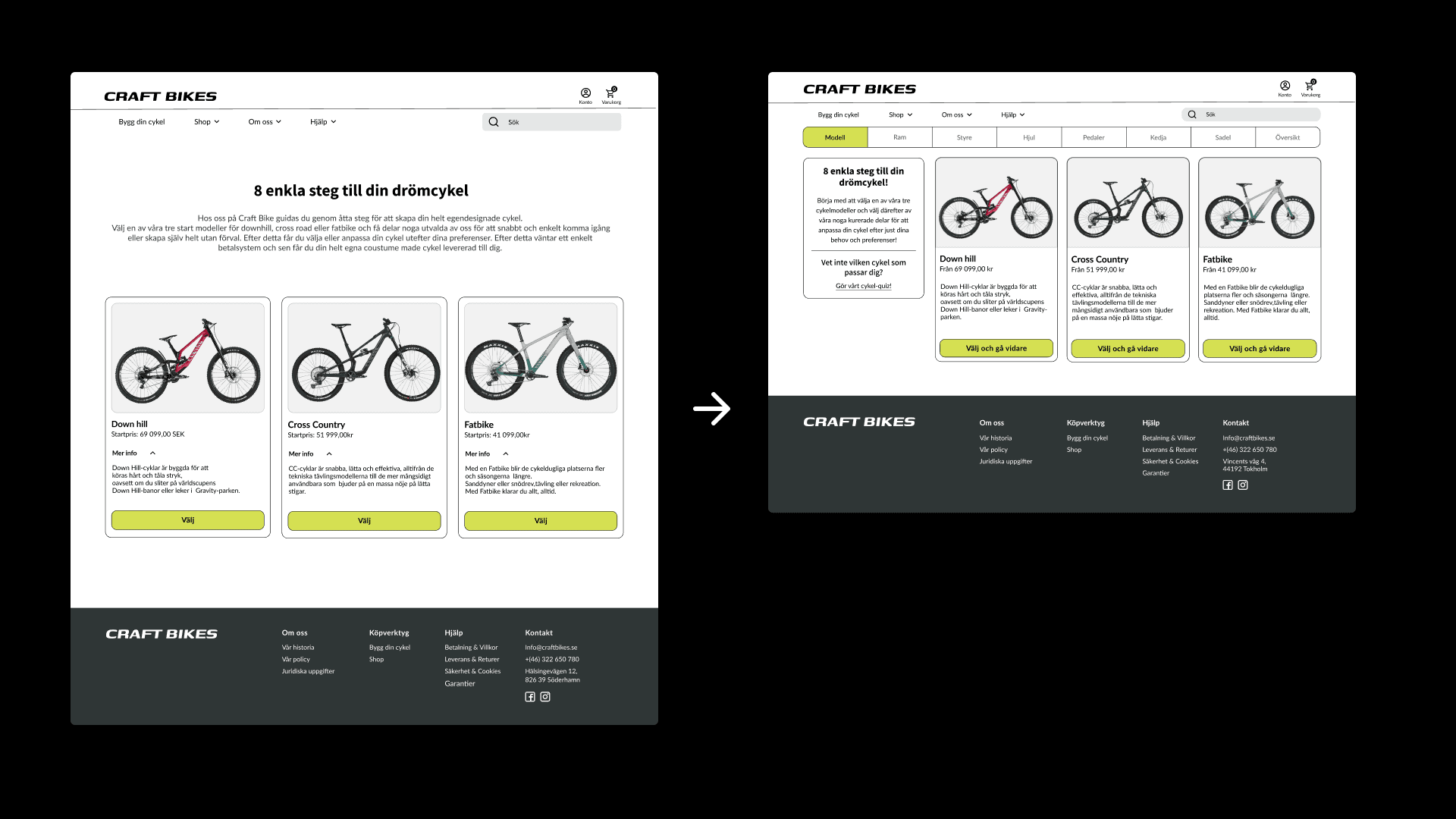
Bike Model Page: Shorten the "Build your bike in 8 steps" text and increase visibility for bike models on small screens. Provide more comparative information and possibly a quiz to help users choose the right model.
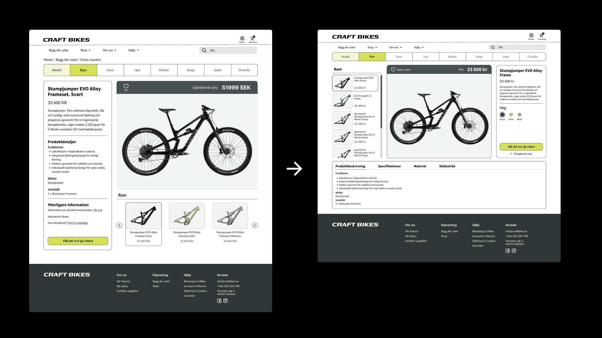
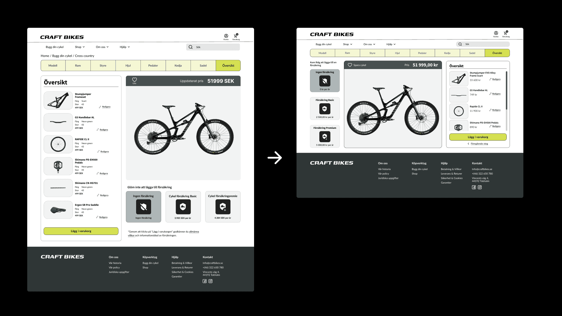
Component Selection: Offer a clearer overview of options, minimize page jumps when changing parts, and present all choices on a single page if possible. Ensure all information is updated correctly and reduce scrolling by making content smaller. Consider moving the "select part and move on" button to the right for a more natural flow.
Navigation: Use either "breadcrumbs" or "wizard" navigation, not both. Change the "like" button to "save" for clarity, and clearly indicate where and what is saved.






Conclusion
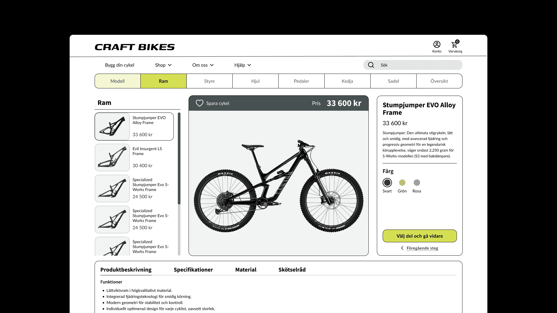
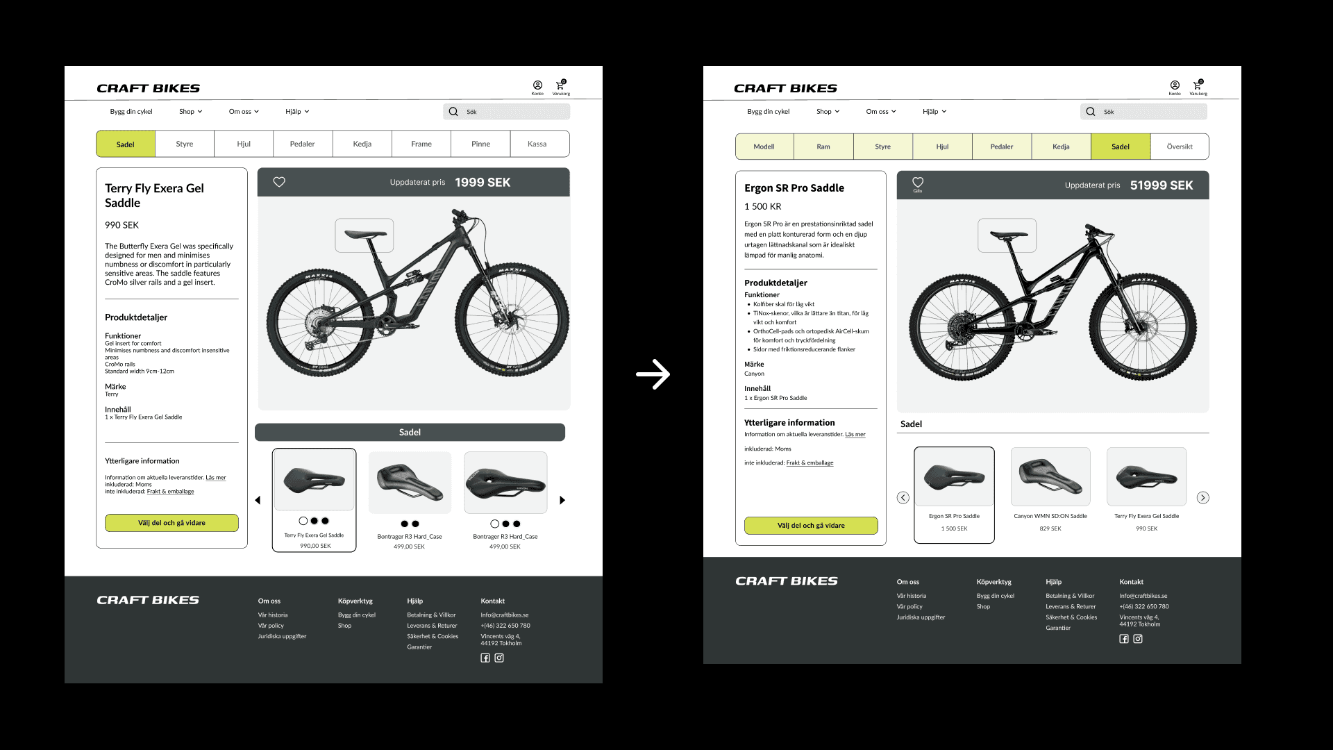
After the final usability test there was an individual assignment to make improvements on the interface based on the feedback we recieved. I decided to focus on making the interface more adapted to smaller desktops since the components were precieved as pretty big durng testing and the users had to scroll to see the different options and the "choose and next step"-button. I also made some changes to the "choose your bike-model"-page to make it more cohesive to the rest of the workflow.
Working on Craft Bikes was a rewarding experience that has enhanced my skills in UI/UX design and research. The project underscored the importance of user-centered design, where thorough research and iterative processes played a crucial role. The continuous user testing, by both our peers and target demographic, helped us iterate and improve our design.
The challenges we faced, from refining the color scheme to optimizing the user journey, pushed me to think critically and adapt creatively. This project deepened my understanding of how to design truly user-focused digital experiences.